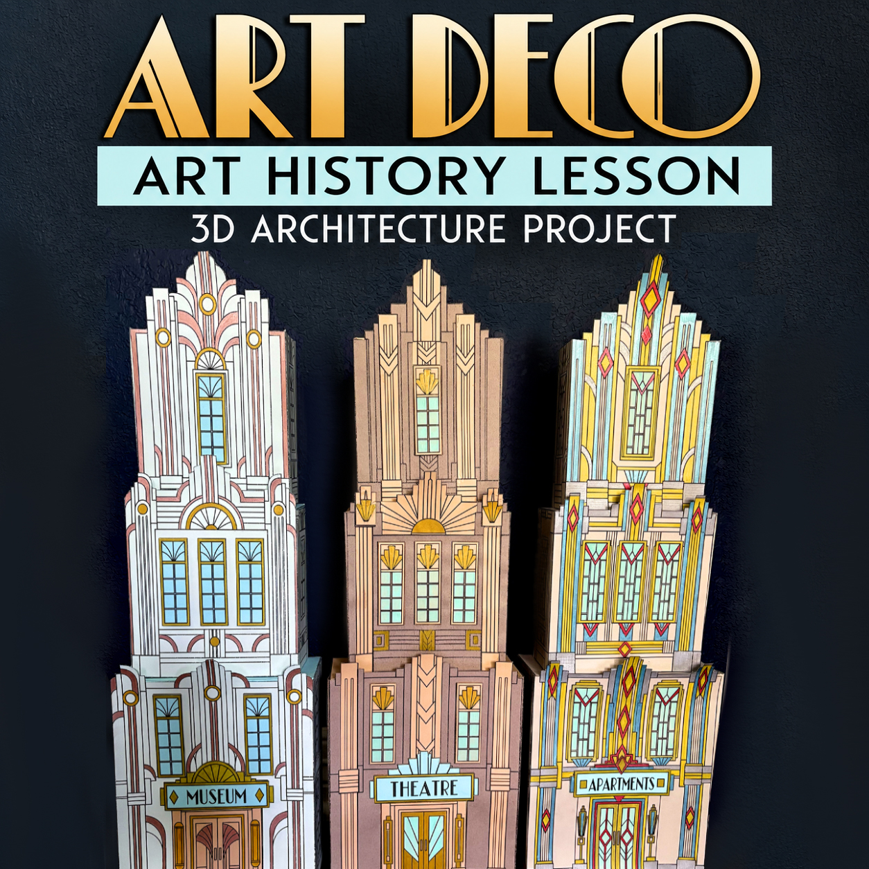
I accidentally built an Art Deco City
Sometimes a project begins with a very sensible idea.
And then, somewhere along the way, it becomes three 26-inch skyscrapers taking over your workspace.
That is more or less what happened here.
When I started designing this Art Deco art history lesson, I knew I wanted the project to focus on architecture. Art Deco is simply too much fun to stop at a worksheet. The dramatic setbacks, geometric ornament, decorative windows, metallic details, towering skyscrapers – it practically begs to be turned into something three-dimensional.
What I did not realize was how far down the architectural rabbit hole I was about to go.
Then Came the Templates
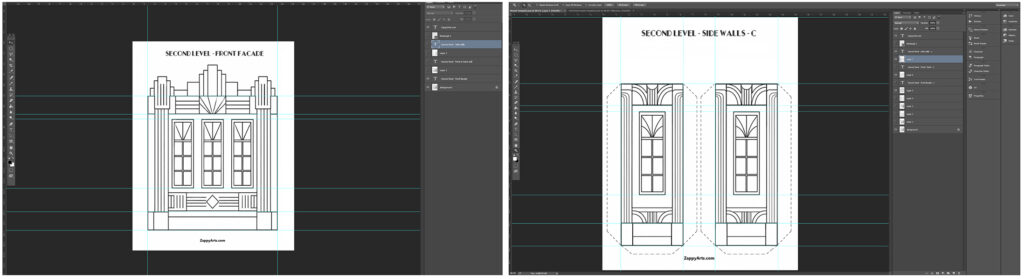
This was the part where my interior architecture and design background became both useful and slightly ridiculous.
Every level had to fit the next one correctly. The setbacks had to line up. The bases had to sit properly. The roof pieces had to work. The walls had to meet. And because the finished skyscrapers are approximately 26 inches (66 cm) tall, a tiny discrepancy repeated over several pieces suddenly wasn’t so tiny anymore.
There were several days when I felt as though I had been staring at lines and pixels for so long that I was beginning to see double.
But eventually came the wonderful moment every template designer waits for:
Everything fit.
Not approximately.
Not “close enough.”
Like a glove.
And yes, I was ridiculously happy about that.
One Building, Lots of Possibilities
Once the structure worked, I started experimenting with the façades.
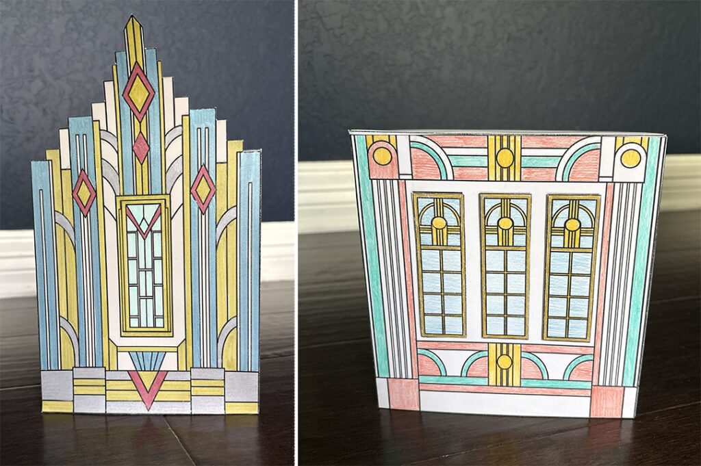
One version was very simple: decorate the printed façade and add only a dimensional sign.
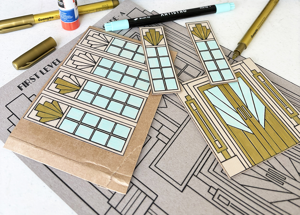
For another, I mounted windows, doors, and signs onto thin cardboard before attaching them to the building. That little bit of thickness creates surprisingly effective architectural depth.
Then I tried something different. I printed another copy of the same façade onto contrasting cardstock, cut out selected architectural details, and layered those pieces directly over the original façade. It created a completely different look without adding much thickness at all.
And, of course, the entire project can simply be printed on white cardstock and colored.
That became one of my favorite things about the finished project. There really isn’t one “correct” way to make these buildings.
A Shortcut I Wish I Had Thought of Earlier
Naturally, I also discovered a few things by doing them the unnecessarily difficult way first.
At first, I carefully cut out individual windows from the printed sheet. Then I glued them onto cardboard.
Then I cut them out again.
After doing enough of those, the obvious finally occurred to me: roughly cut around an entire row of windows, glue the whole thing onto cardboard, and then do the precise cutting once.
Much better.
Sometimes product development is sophisticated architectural problem-solving.
Sometimes it is realizing you have been cutting the same window twice.
The Great Paper Experiment
Another surprise was cardstock.
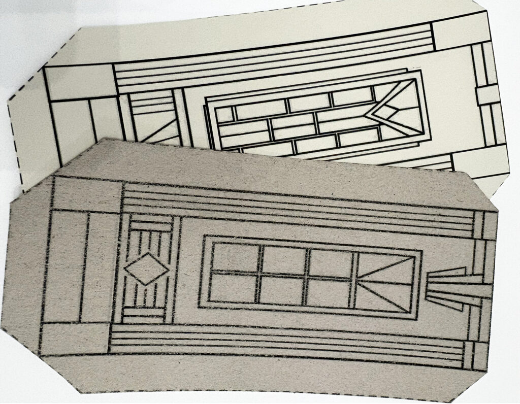
I had several sheets from the same package with approximately the same paper weight, but some had a slightly textured surface. At first I thought the textured cardstock might actually be better because it felt sturdy.
It wasn’t.
The printer toner did not adhere evenly to the raised texture, so portions of the printed lines could rub away from the high points of the paper. The stiffer textured surface also made glued tabs more likely to pull apart.
The smooth cardstock printed much more cleanly, folded better, and stayed glued.
So this project produced a very specific new rule in my studio:
Smooth cardstock wins.
Glue Stick Wins Too
There was also a glue experiment.
Liquid glue seemed like the obvious choice for a sturdy three-dimensional structure, so naturally I tried it.
And then I waited.
And held the paper.
And waited some more.
For most of this project, a regular glue stick worked much better. It grabs quickly, keeps the paper flatter, and doesn’t make the cardstock wavy. It is especially important for the façade, where liquid glue can distort the paper.
I found only one place where liquid glue was genuinely helpful: the hidden connection between stacked building levels. That area is difficult to press firmly from both sides, and because it disappears between the levels, a small amount of stronger glue works beautifully there.
Everywhere else?
Glue stick.
A Ten-Year-Old Improved My Assembly Method
One of my favorite discoveries came while testing whether the construction process was manageable for a child.
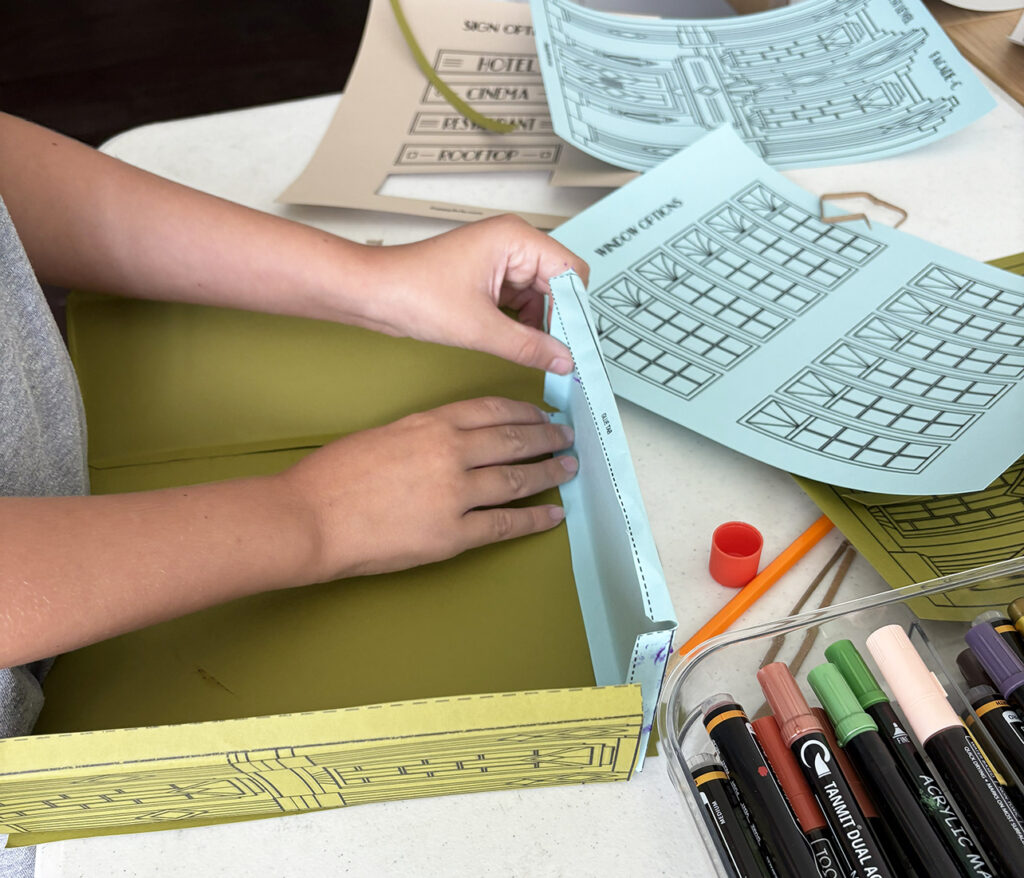
My original method was to connect all four walls and then attach the roof.
It worked.
Then I watched a ten-year-old assemble a building level differently.
Three walls first.
Then the roof.
Then the final wall.
And I immediately realized his method was better than mine.
With the fourth wall still open, you can reach inside the structure and press the roof tabs securely into place. Once the roof is attached, the final wall closes everything up.
So the official assembly method was changed.
Apparently having a degree in interior architecture does not prevent you from being out-engineered by a ten-year-old.
About Those Fancy Rooflines…
I love the stepped crowns.
They are one of the features that makes these buildings unmistakably Art Deco, and they look fantastic when the skyscrapers are assembled.
They also involve more careful cutting.
Testing confirmed what I suspected: younger students – or anyone whose patience for navigating scissors around a collection of tiny architectural setbacks has reached its limit – may prefer something simpler.
So every building also includes a flat-top option.
The dramatic stepped version is there for students who want the challenge. The simpler version makes the project much more accessible without changing the basic building.
Everybody wins.
And Then the City Became HUGE
Individual pieces on a computer screen have a funny way of disguising scale.
Once all three levels were stacked, I stood back and realized these were not little paper buildings.
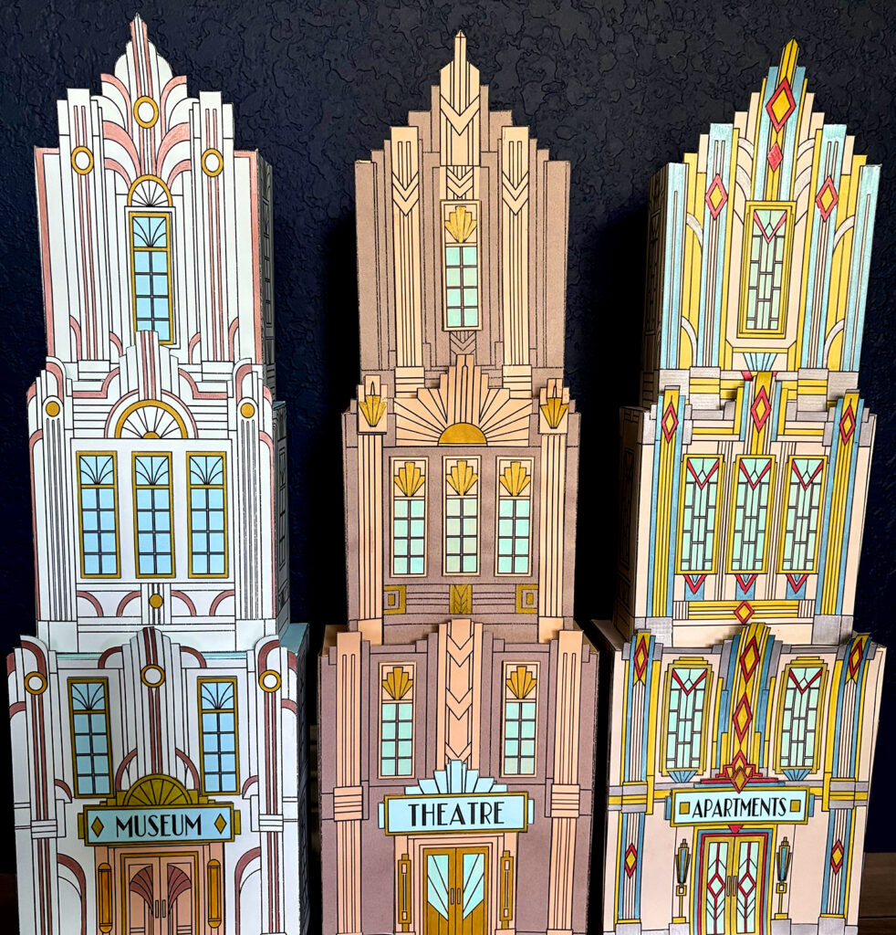
Each completed skyscraper is approximately 26 inches (66 cm) tall.
Put three together and suddenly you have a proper skyline.
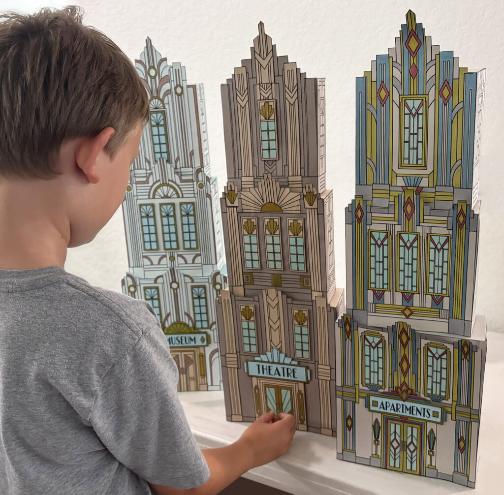
That was also when another classroom idea occurred to me.
For a large class, every student doesn’t need to construct an entire skyscraper. One group can make first levels, another second levels, and another third levels. At the end, mix and match them.
The colors won’t match.
The decorative choices won’t match.
The architectural details won’t match.
And that is exactly why I think it would look fantastic.
Imagine an entire classroom’s worth of mismatched Art Deco levels assembled into one enormous, colorful collaborative city.
From Art Deco to Video Games… and Back Again
Somewhere in the middle of all this designing, cutting, folding, and building, I had one of my favorite realizations of the entire project – and it came from video games.
Somehow our conversation wandered to New Donk City in Super Mario Odyssey and then to Luigi’s Mansion 3. And suddenly I realized something: my kids were already familiar with the look of Art Deco. They just didn’t know it.
Luigi’s Mansion 3 was an especially fun example. The game takes place inside the wonderfully over-the-top Last Resort hotel, and its design draws heavily on Art Deco influences – geometric patterns, dramatic symmetry, metallic details, stylized ornament, glamorous interiors, and that unmistakable feeling of a grand hotel from another era.
That is one of the things I love about teaching art history. Students sometimes assume they are learning about something that belongs entirely in the past, only to discover that its influence is still hiding all around them.
Art Deco didn’t disappear when the 1930s ended. Its visual language continues to appear in architecture, movies, graphic design, interiors, and even the imaginary worlds kids explore in video games.
Suddenly those zigzags, stepped shapes, dramatic entrances, geometric patterns, and shiny decorative details aren’t just features on an old building in an art history lesson. They’re things students may have seen many times before without having a name for them.
And once they do have a name for them, they can start spotting them everywhere.
That realization ended up becoming one of my favorite ideas behind this entire lesson: Art history isn’t only about learning to recognize the past. Sometimes it teaches you to see the present differently.
One More Idea… Because Apparently I Can’t Stop
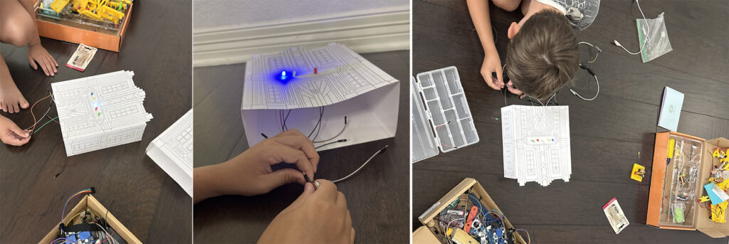
Of course, once the city was standing, someone in my house who has been experimenting with LEDs and electronics looked at it and another idea was born:
What if we light the city?
And now I can’t unsee it.
Tiny lights glowing behind Art Deco windows at night?
Yes, please.
That experiment will have to wait for another day, but the electrical tinkering has already begun.
From a Drawing to a Skyline
What I like most about this project is that it ended up being far more flexible than I originally planned.
A student can complete just a decorated façade.
They can add a few dimensional architectural elements.
They can construct one building level.
They can build an entire three-level skyscraper.
Or a class can combine everyone’s work into a collaborative city.
Somewhere between the first sketch, the endless template adjustments, the cardstock experiments, the glue tests, the cardboard windows, and being shown a better construction method by a ten-year-old, this became exactly the kind of project I love creating: one where learning about art history leads naturally into making, experimenting, problem-solving, and designing.
And after staring at Art Deco lines for what feels like approximately 400 years, I finally have a skyline standing in front of me.
I think it was worth it.
Ready to Build Your Own Art Deco City?